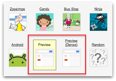
Are you a fan of the ‘Themes’ that are available in Google Mail? We think it’s really neat that you can change what your inbox looks like depending on the mood you’re in that day. If you have a vacation coming up and you’re headed to the beach, you can turn on the ‘Beach’ or ‘Summer Ocean’ theme to get you in the mood (just don’t get to distracted, you have work to finish!) Maybe you just signed up for Karate classes and you want get in the zone before your first lesson…turn on the ‘Ninja’ theme and karate chop your way through those emails.
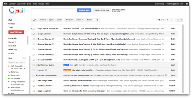
Google has now begun to change their theme with a new look that offers a more modern, less cluttered, straight forward view of the inbox and it’s now available for you to preview!
To enable this new theme, click on the ‘gear’ in the upper right hand corner of your inbox, select ‘Mail Settings’ and click on ‘Themes’ to the far right on the settings options. After arriving at the ‘Themes’ section, locate the ‘Preview’ theme and the ‘Preview (dense)’ theme and select the view accordingly. There are two options due to the fact that Google is accommodating users with larger screens and specific user preferences.
After enabling the new theme, take a few minutes to look around and see some of the differences. You’ll notice a more visible ‘Search’ option at the top of the inbox. You’ll also notice a big red ‘Create’ button where you click to create new messages. We think the new view is a little easier to navigate and has an overall ‘clean’ feel to it.
Google is in the process of releasing their ‘new look’ to the other applications in the Google Apps platform (Calendar, Docs, & Sites) and we plan to keep you updated via our blog so keep an eye out for future posts on Google Apps’ new look! Let us know what differences you see and your initial thoughts in the comments section below.
