If you are ever experiencing any issues with the applications in the Google Apps platform, one of the first places you should look to see if what you are experiencing is a known issue is the Google Apps Status Dashboard. The Apps Status Dashboard is open to the public and will provide you real time performance updates on the services utilized on a consumer level and to organizations using Google Apps.
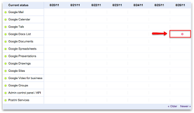
Google has recently updated the Apps Status Dashboard to provide us with a more detailed, less cluttered view of the services performance level. Some of the changes that you will notice are:
- Only service disruptions and outages will be shown
- The ‘dot’ size indicates the the amount of time per outage
- The ‘dot’ will expand to a ‘line’ if the outage is being experienced for an extended period of time
- The color of the ‘dot’ will indicate the severity of the issue
- Green – No Issues
- Orange – Service Disruption
- Red – Service Outage
Another very useful feature that Google has added is the ability to click on the ‘dot’ for a detailed explanation of the outage or disruption. After you have clicked on the ‘dot,’ you will see a new webpage providing details of the disruption from start to finish.
If the issue you are experiencing is not listed on the Apps Status Dashboard and is causing major issues within your organization, please contact your service provider for additional support.


